Everfit Nailed the Sign-Up (But the Aha Happens to Someone Else)
5 min read · about Everfit ·

Everfit Nailed the Sign-Up (But the Aha Happens to Someone Else)
1 / 31

Written by
Eddy Bogomolov
Product designer for free trials
Published
What you'll learn
- A fast sign-up doesn’t mean users have experienced value. Everfit got me into the product in 93 seconds without a credit card. But I left without experiencing the moment that would convince me to pay.
- Design onboarding around the outcome, not a feature checklist. For a coaching platform, that means seeing a workout you’ve created appear on your client’s phone. Every onboarding step should move users closer to that moment.
- Don’t put another sign-up between users and value. Everfit sent me from my desktop to an email, an app download, and a password I never created. Each extra step gave me another reason to leave.
I tried Everfit as a coach. Getting started was effortless, but seeing what my clients would experience meant switching devices, downloading an app, and entering a password I never created.
Everfit Nailed the Sign-Up (But the Aha Happens to Someone Else), chapter by chapter
In this story, I run a small wellness studio with fewer than ten clients. I send their workouts through PDFs and WhatsApp messages. I'm looking for one app where I can build workouts and my clients can follow them on their phones.
So I tested Everfit, a fitness coaching platform, and recorded the journey from its homepage to the product. The sign-up was one of the smoothest I've tested. But getting into the product and seeing why it's worth paying for turned out to be two very different things.
Let's get into it.
1. The homepage builds trust, but doesn't explain the product
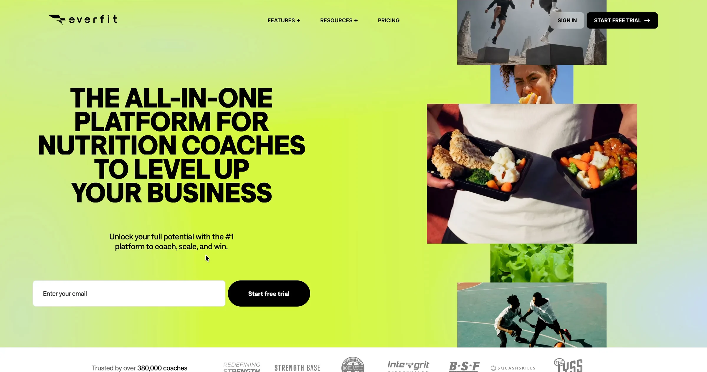
I open Everfit's homepage. The first thing I see is a headline:
“The all-in-one platform for nutrition coaches to level up your business.”
The headline changes every two seconds, switching between sports coaches, fitness coaches, gyms, and studios.
One of them is me. Good start.
But “all-in-one” and “level up” don't tell me what I'll actually be able to do.
❌ Explain what your product does, not just who it's for.
Everfit changes the headline to speak to different types of coaches. That's smart. A gym owner can immediately recognize that the product is meant for them.
But recognizing yourself in a headline isn't the same as understanding the product.
The supporting message doesn't help much either:
“Unlock your full potential with the #1 platform to coach, scale, and win.”
That could describe almost any business software.
I'd rather see something concrete: build workouts, manage clients, and deliver training through one app.
The lesson: Your homepage should quickly answer three questions: Is this for me? What can I do with it? Why should I care?
The visuals sell fitness, not the software
Neon lime, huge black headlines, athletes training, and meal prep photos.
It looks energetic. It feels like fitness.
But there's no product in the hero. No coach dashboard, no workout calendar, no client app.
I'm about to try software I haven't actually seen.
❌ Show what people are signing up for.
Product Hunt CEO Rajiv Ayyangar has simple advice for product imagery: “Show the UI.”
For Everfit, I'd show two screens side by side: a coach building a workout and a client following it on their phone.
That's the value I'm looking for.
Photos of athletes show the feeling. Product screenshots show what I'm buying.
The lesson: Don't make visitors imagine how your SaaS works. Show them what they'll be able to accomplish.
Social proof gives me a reason to trust it
Below the hero, Everfit tells me:
“Trusted by over 380,000 coaches.”
There's also a row of logos from coaching businesses and gyms.

I don't recognize Strength Base, Integrit Performance, or SquashSkills. But they're businesses similar to mine.
And 380,000 coaches is a lot.
I still don't know exactly what the product looks like, but now I have a reason to believe it's worth trying.
✅ Show that people like your visitors already use your product.
The number builds credibility. The logos make that credibility relevant to my business.
Together, they reduce some of the uncertainty around trying an unfamiliar product.
The lesson: Social proof works best when visitors can recognize themselves in the customers you show.
The trial starts right where the promise is
Good enough to try.
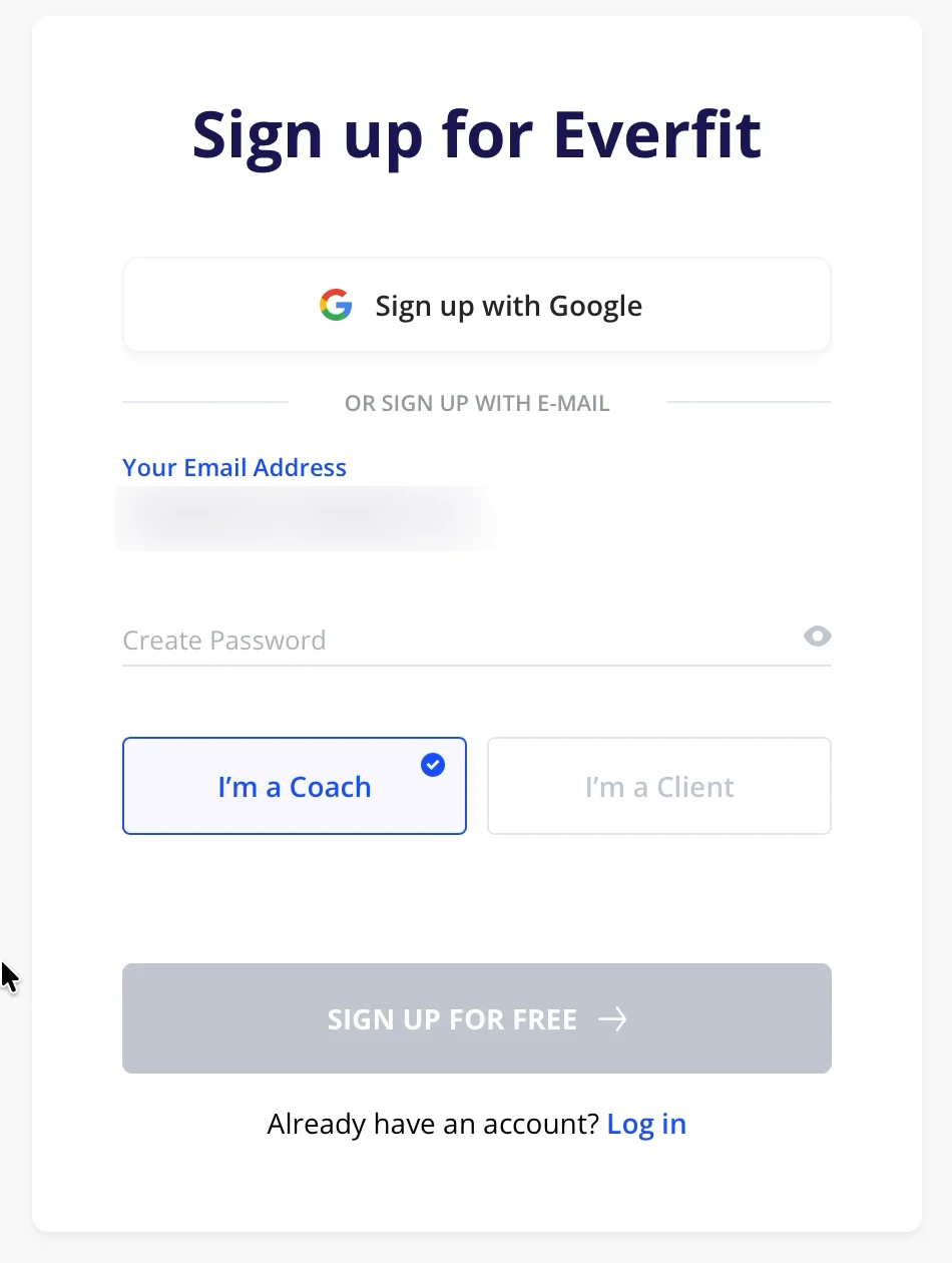
There's an email field directly under the homepage headline. I type my email and click “Start free trial.”
The next screen already has my email filled in.
It asks for a password, but I choose “Sign up with Google.”
✅ Remove unnecessary steps between interest and sign-up.
Everfit doesn't make me search for the sign-up form. The email field is right where I'm already reading about the product.
And when I move to the next screen, my email comes with me.
One less thing to type.
The lesson: When someone decides to try your SaaS, make the next action obvious and avoid asking for information they've already provided.
What I'd test
I'd start with the homepage hero.
My hypothesis: Showing the coach and client experience together would make Everfit's value easier to understand and encourage more qualified visitors to start a trial.
I'd test a version with a clearer headline, the coach's dashboard next to the client's phone, and the existing email field.
Then I'd measure two things: how many visitors start a trial and how many of those trials reach the first meaningful product outcome.
Because more sign-ups only help if those users eventually experience value.
Everfit's homepage isn't perfect. But the social proof gives me enough confidence to try it, and the email field makes starting easy.
Now I'm in the sign-up flow. And this is where Everfit gets surprisingly good.
2. From sign-up to product in 93 seconds
Step 1 of 3.
“Nice to meet you! What should we call you?”
My name is already there, filled in from Google.
I click Continue.
On the left, Everfit reminds me what I'm getting: a 30-day trial, all Pro features, and no credit card required.
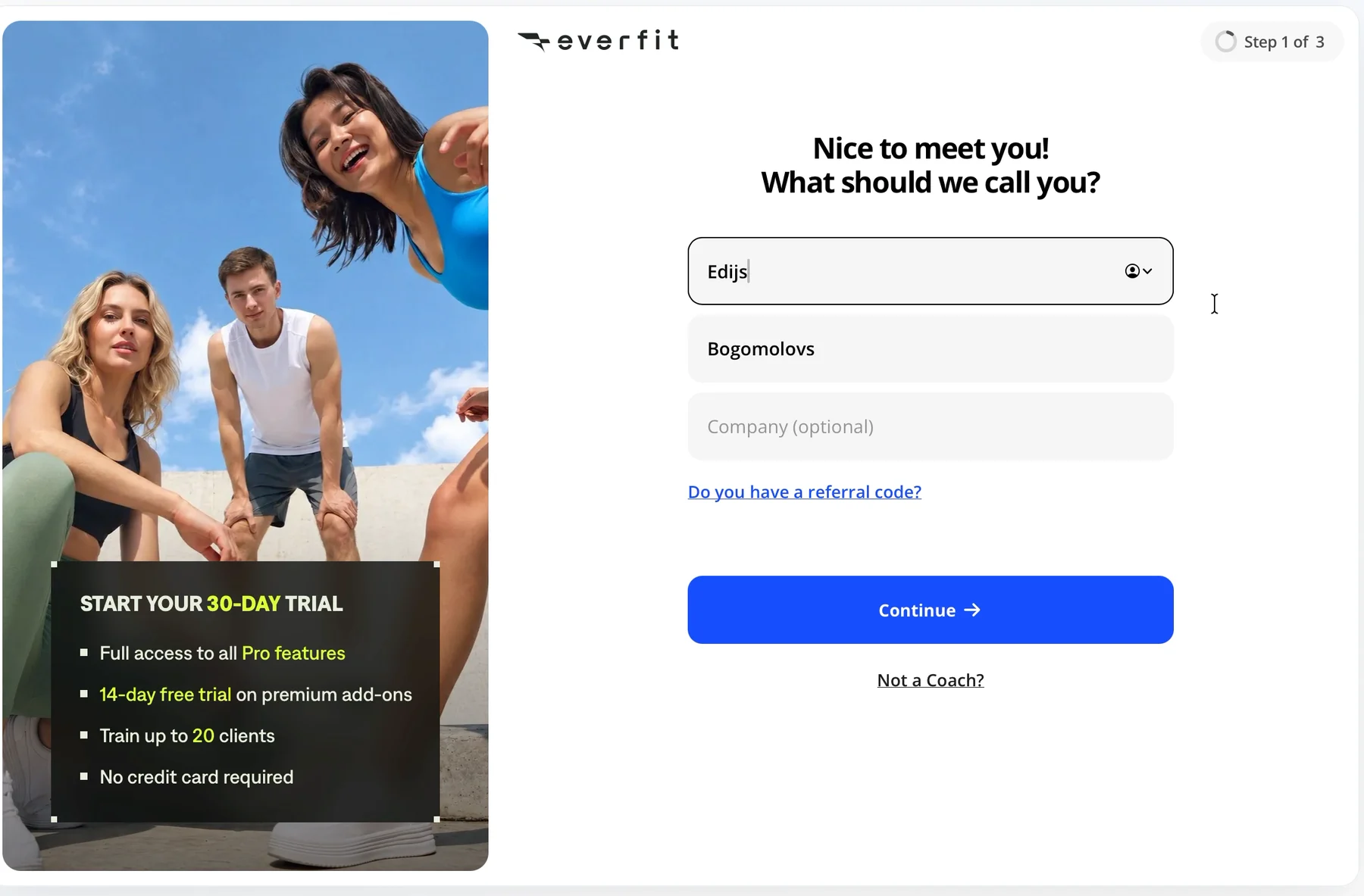
✅ Don't ask users for information you already have.
Google already knows my name. Everfit uses it.
It sounds like a small detail, but many products still ask users to type information they've just provided through Google sign-in.
Everfit also tells me exactly how many steps are left. No guessing how long this will take.
The lesson: Use information from sign-in, show progress, and make trial terms clear before users commit.
The second step feels like a conversation
Instead of a long form, Everfit gives me a sentence with blanks:
“I am a Owner. I work at a wellness center. I have 1-10 clients. I am a new coach.”
Then it asks what I want to offer.
I select Workout Training, Nutrition Coaching, and Booking & Scheduling.
Remember that last one.
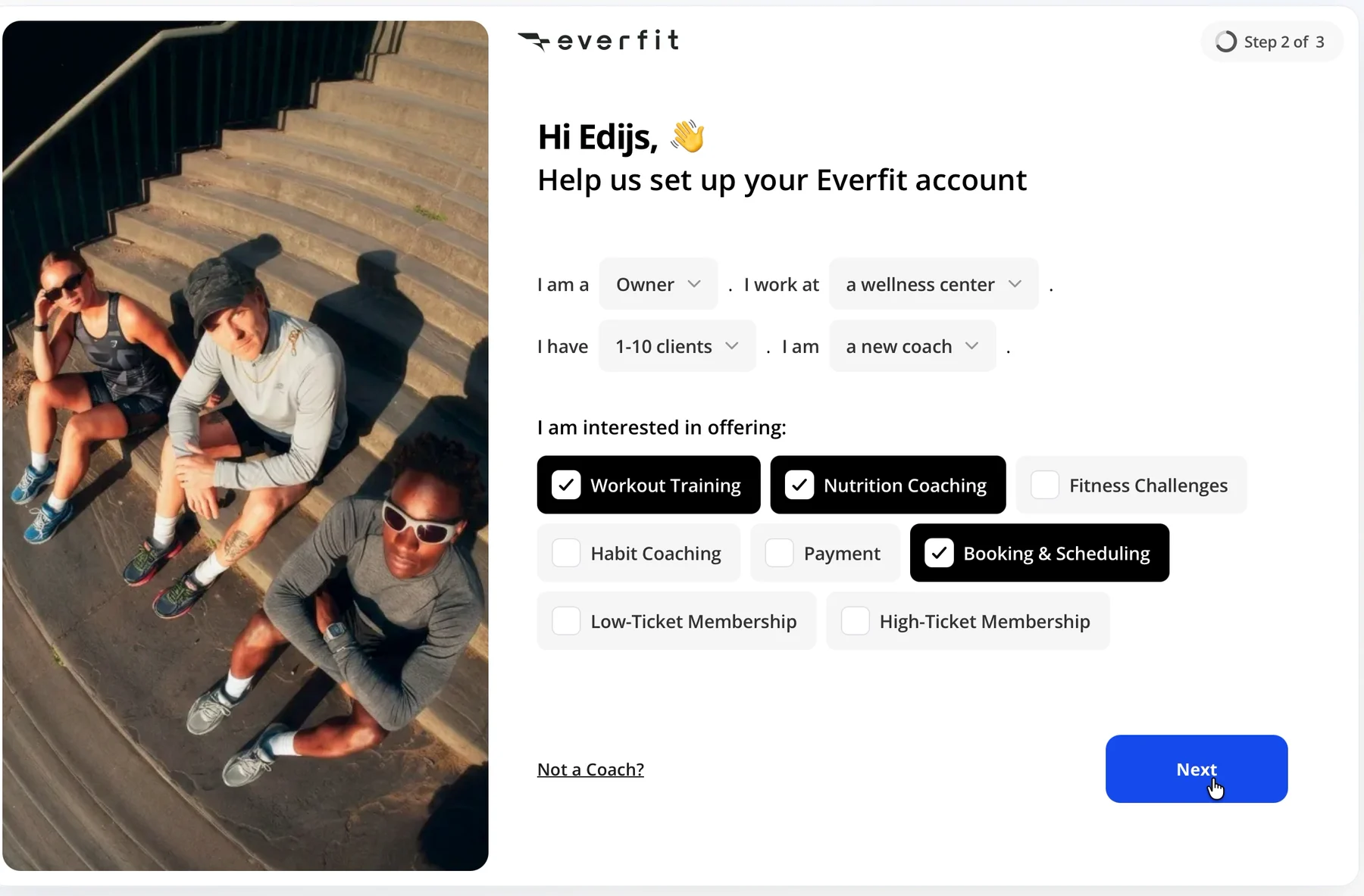
✅ Ask questions that help users describe their goals.
This is a good way to collect information. Rather than making me fill out a traditional form, Everfit lets me describe my business in a sentence.
The answers could help the product understand what I need and personalize my first experience.
But there's an important condition: if you ask users what they want, you should use their answers.
We'll come back to that.
One final question, and I'm done
Step 3 of 3:
“How did you hear about us?”
I select Google.
Done.
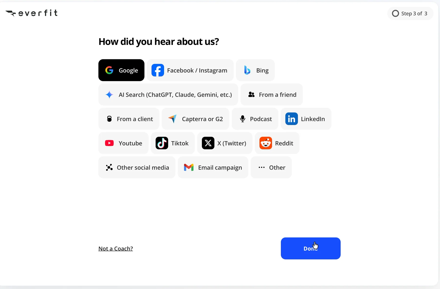
From clicking “Start free trial” to reaching the product: 93 seconds.
That's one of the fastest sign-ups I've tested.
Then Everfit shows me a welcome video.
“Everything, all-in-one place.”
Seventeen seconds pass between finishing sign-up and reaching the first product screen.
I don't want to watch a video about the product.
I want to use it.

❌ Don't explain value when you could demonstrate it.
Everfit already has something better than a welcome video: demo clients with full workout calendars.
Instead of telling me what the platform can do, it could open directly on a prepared example.
I could see a workout, a client, and a calendar without creating anything myself.
The lesson: Once users finish signing up, help them do something meaningful. Don't automatically send them into another presentation.
What I'd test
I'd compare the current welcome video with an experience that opens directly on a demo client.
My hypothesis: Letting coaches interact with a prepared workout immediately will help more of them reach their first meaningful action.
I'd measure how many new coaches assign a workout and how long it takes them to do it.
The goal isn't just to shorten onboarding.
It's to shorten the time between signing up and understanding why the product is useful.
3. Everfit asks what I need, then gives me the same checklist as everyone else
The first product screen says:
“Welcome to Everfit, Edijs!”
Below it is a getting-started checklist with seven items.
Experience Client App. Five coaching basics. Download Coach App.
“0 of 7 completed.”
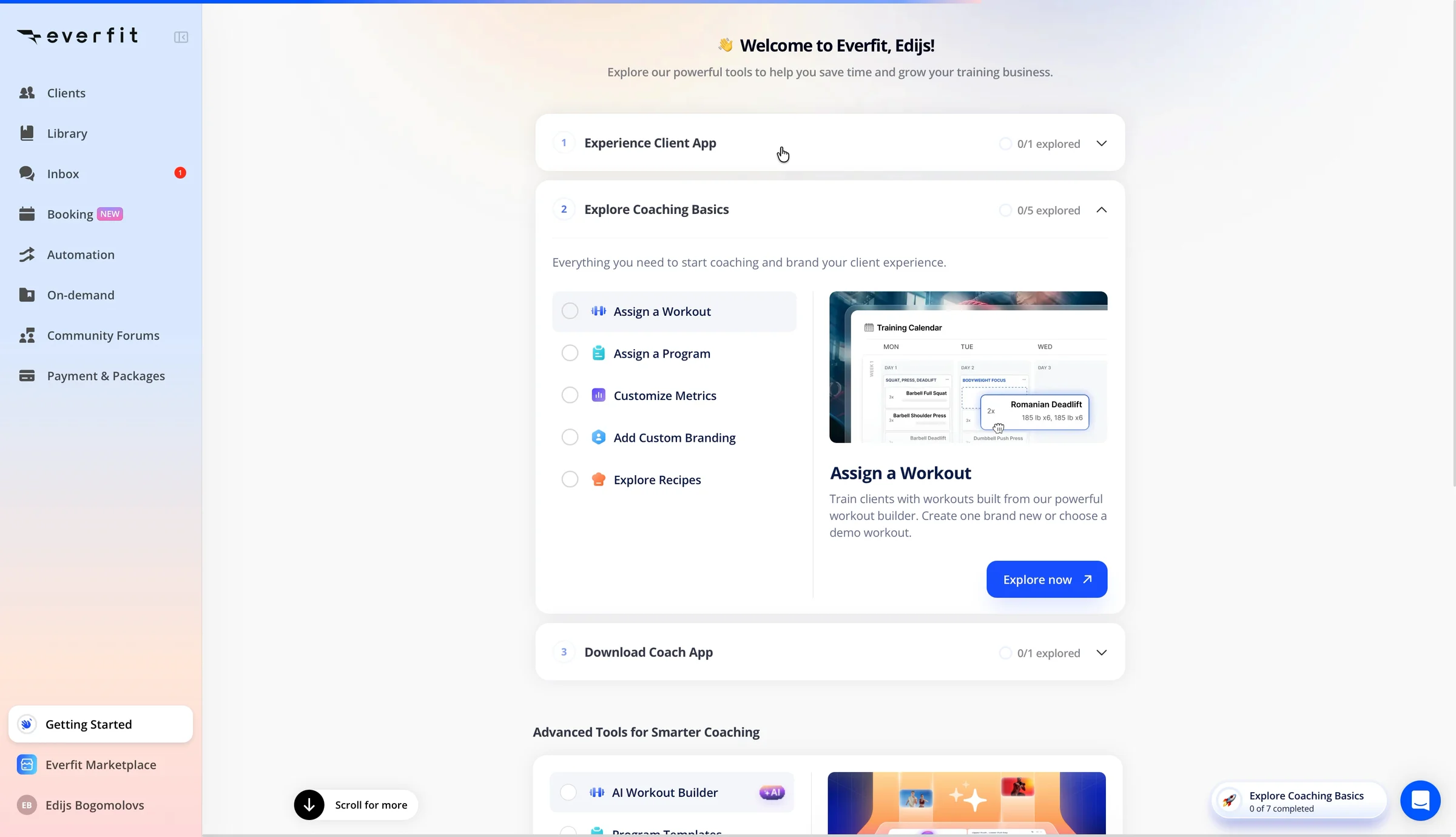
Remember when I selected Workout Training, Nutrition Coaching, and Booking & Scheduling during sign-up?
Booking isn't on the checklist.
It's sitting in the sidebar with a “NEW” badge.
The onboarding looks the same regardless of what I told Everfit I wanted to do.
❌ If you ask users about their goals, use the answers.
Everfit already knows that I run a small wellness studio, have fewer than ten clients, and want to offer workouts, nutrition coaching, and booking.
That's useful information.
But the first screen doesn't reflect those priorities.
Instead, I get seven generic tasks.
A checklist can help users get started. But completing a checklist isn't the same as accomplishing something valuable.
If I came here to manage client workouts, why should I spend time learning features I don't need yet?
The lesson: Personalize onboarding around what users came to accomplish, not everything your product can do.
What I'd test
I'd replace the generic checklist with a short plan based on the answers collected during sign-up.
For my studio, that might be:
- See how a workout appears to a client.
- Assign your first workout.
- Explore nutrition coaching and booking.
Three relevant steps instead of seven generic ones.
My hypothesis: A goal-based onboarding plan will help more coaches complete their first meaningful action.
I'd compare the percentage of coaches who assign a workout and invite a real client, not just how many checklist items they complete.
Because a completed checklist is only useful if it moves someone closer to getting value.
And Everfit's first checklist item points to the most important moment of the entire trial.
4. The moment that should sell Everfit happens on someone else's phone
The first item in the checklist catches my attention:
“Experience Client App. Step into your client's shoes and experience the app as they will, through a personalized demo prepared just for you.”
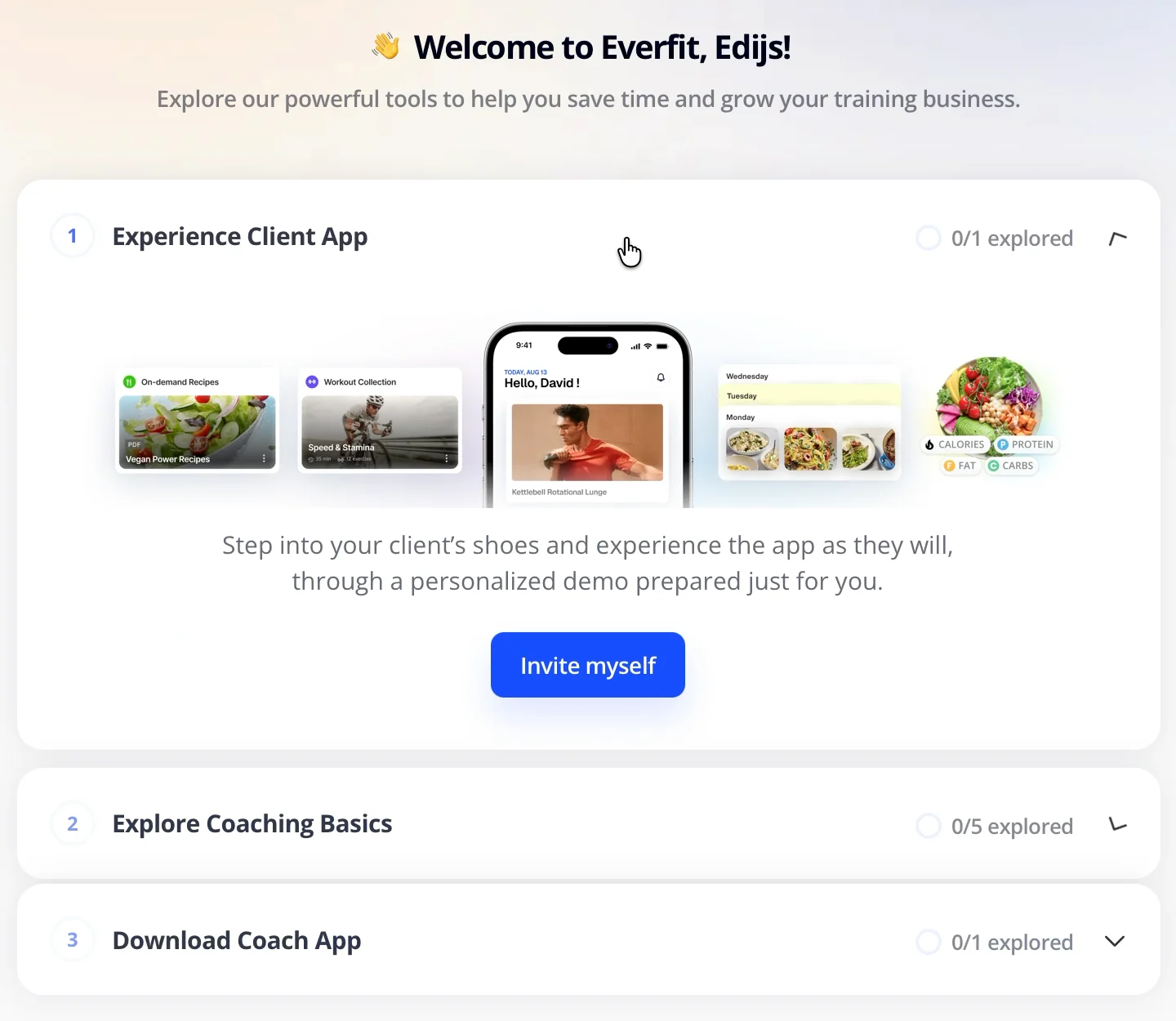
Exactly what I want.
I'm evaluating Everfit as a coach. But the reason I'd pay for it is that my clients could receive and follow their workouts through an app.
That means Everfit has two users.
The coach creates the workout and pays for the software.
The client receives the workout and follows it on their phone.
For me, the moment that makes Everfit valuable is seeing a workout I created appear on my client's screen.
Everfit seems to understand that. It's the first item on the checklist.
I click “Invite myself.”

And then things get complicated.
The product sends me away from the product
A message appears:
“Check your email. Please open the email on your mobile.”
I need to download the Everfit app and log in with my coach email and password.
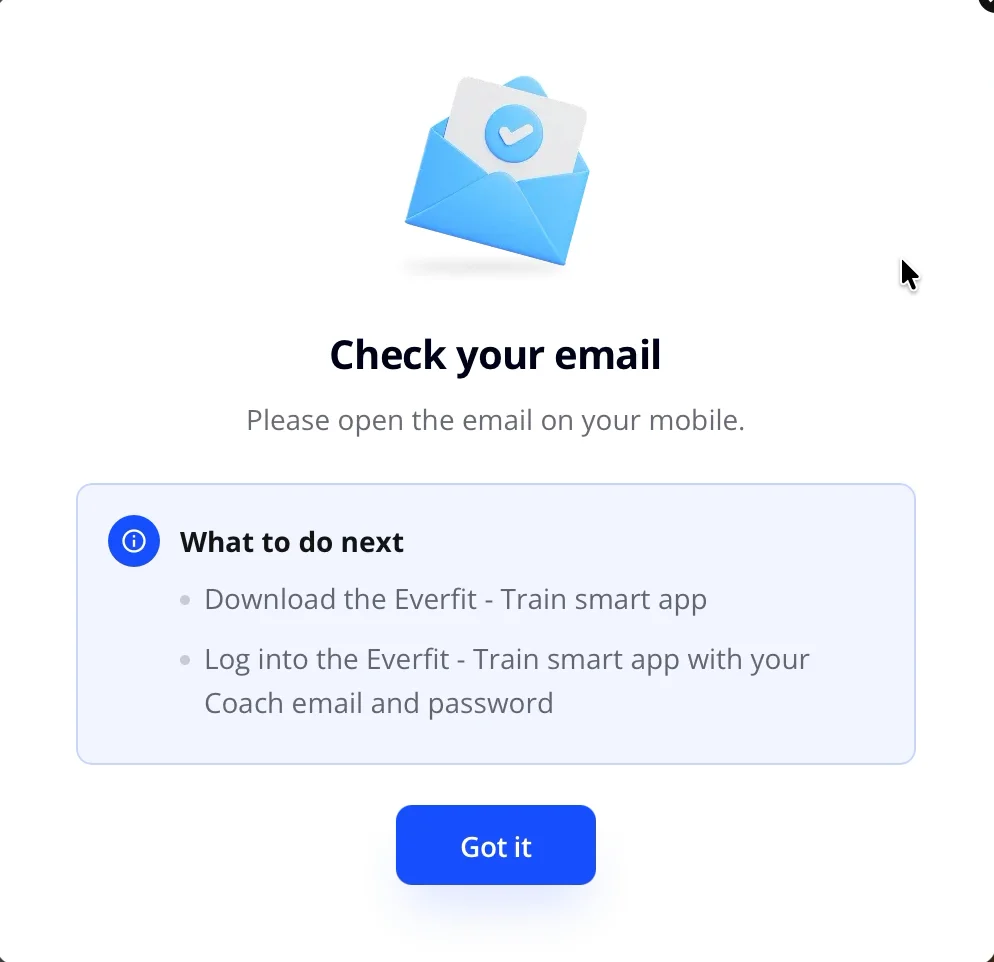
Password?
I signed up with Google.
I never created one.
❌ Don't make users start another onboarding flow to experience value.
Think about what just happened.
I signed up on my laptop to evaluate coaching software.
Everfit offered to show me what my clients would experience.
But instead of showing me, it sent me to my inbox, a mobile app, and a login asking for credentials I don't have.
The moment that could convince me to pay is now somewhere else.
Every additional step creates another opportunity to abandon the experience.
The lesson: Identify the moment that proves your product is useful, then remove as many steps as possible between sign-up and that moment.
The invitation email creates another problem
I open Gmail.
The subject tells me I've been invited by Edijs Bogomolovs.
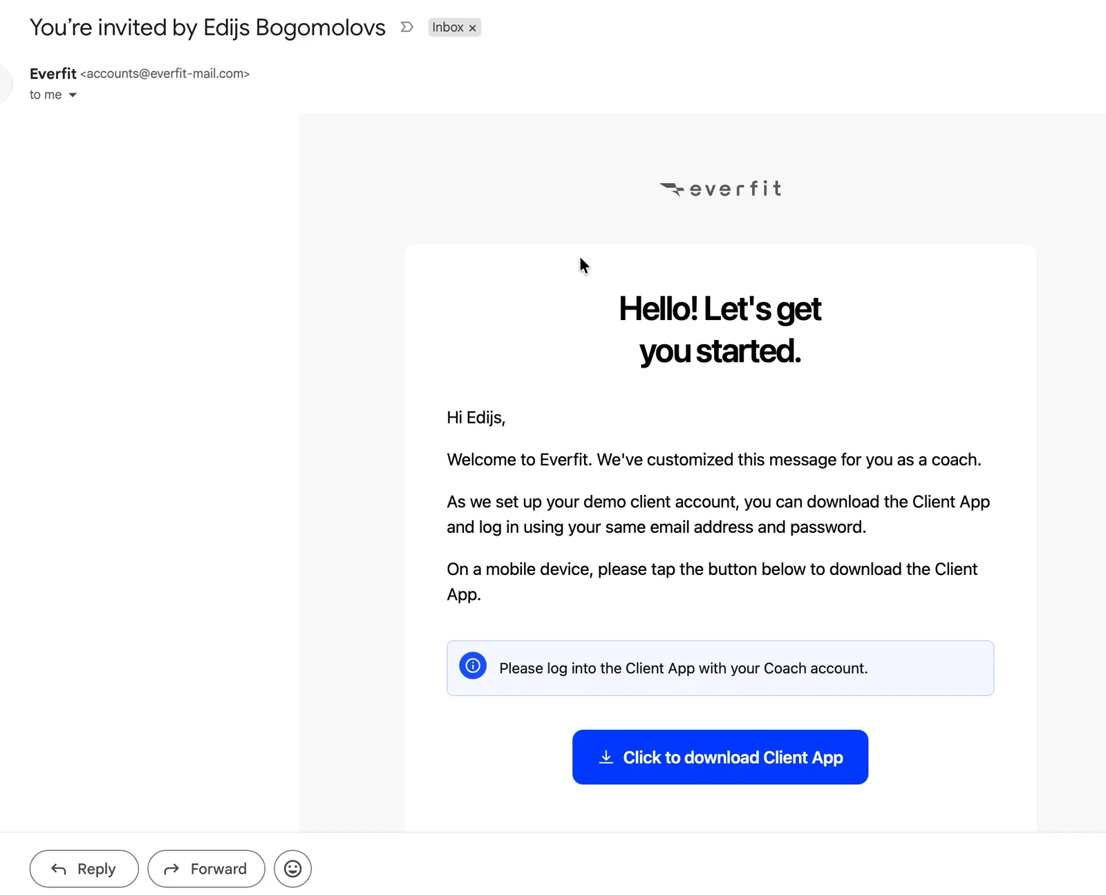
That's me.

The email asks me to download the Client App and log in using the same email address and password.
Again, I don't have a password.
But there's something more important here.
This is also the type of email a real client would receive when their coach invites them to Everfit.
Their first experience of the product is an invitation, an app download, and a login.
For a coach evaluating Everfit, that experience matters.
I'm not only buying software for myself. I'm asking my clients to use it too.
If their first experience is difficult, that creates work for me.
❌ Make the receiving user's first experience easy, too.
In a product where one person invites another, the invitation is part of onboarding.
It shouldn't be treated as an afterthought.
For Everfit, I'd want clients to open an invitation and see their workout with as little setup as possible.
The lesson: If your SaaS depends on invitations, sharing, or collaboration, optimize the experience for the person receiving the invitation as carefully as the person sending it.
What I'd test
I'd start with a browser preview of the client app.
After clicking “Experience Client App,” I should see a simulated client phone next to a demo workout.
No email. No download. No second login.
For coaches who want to test the actual mobile experience, I'd offer a QR code that opens an authenticated demo.
My hypothesis: Showing the client experience immediately will help more coaches understand Everfit's value and continue setting up their accounts.
I'd measure how many coaches view the client experience, assign a workout, and eventually invite a real client.
The important metric isn't whether they clicked “Experience Client App.”
It's whether they actually experienced what their client would see.
5. The demo is useful, but four layers of instructions get in the way
I return to Everfit.
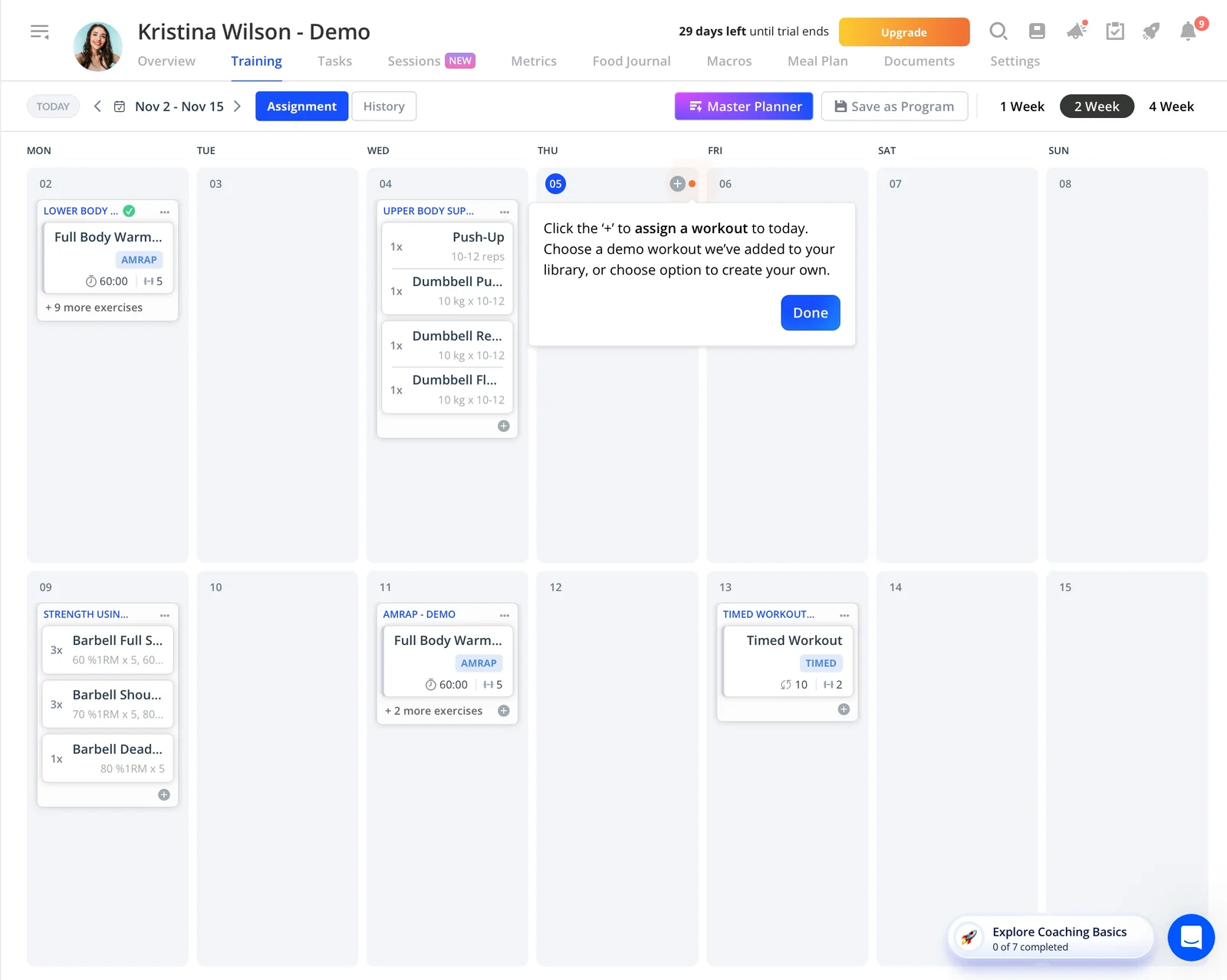
There's a demo client named Kristina Wilson, with two weeks of workouts already on her calendar.
Another demo client, Ben Andrew, is also available.
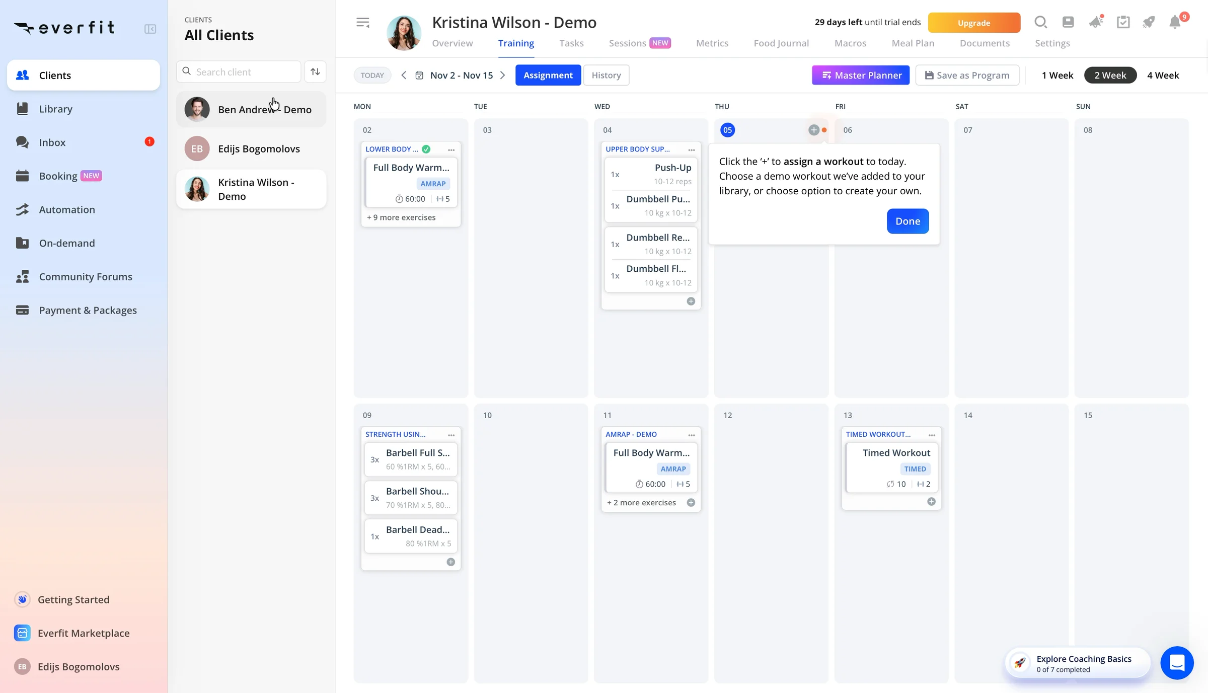
This is good.
I don't have to create a client or build a workout from scratch just to understand the product.
There's already something to explore.
✅ Give users a working example instead of an empty screen.
An empty dashboard makes users do the work before they understand the reward.
Everfit avoids that by providing realistic demo data.
I can see what a client calendar looks like and how workouts are organized.
That's much more useful than a blank page.
The lesson: If your SaaS needs setup before it becomes useful, give new users a prepared example they can explore immediately.
Then the instructions start piling up
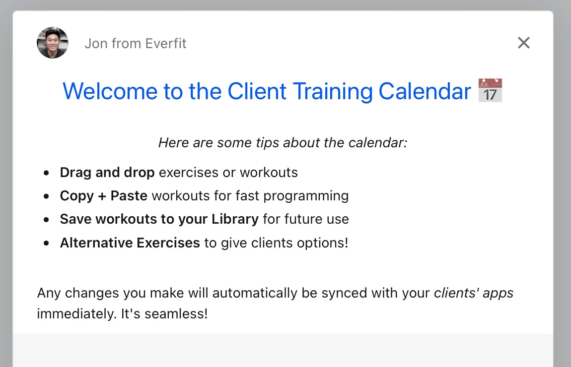
A note from “Jon from Everfit” appears with four calendar tips.
Then a tooltip tells me to click the plus button to assign a workout.
Seconds later, a dark overlay appears with two arrows.
One points to learning how to start training in less than five minutes.
Another points to exploring demo clients.
A checklist slides in from the right.
“Click anywhere to close.”
I do.
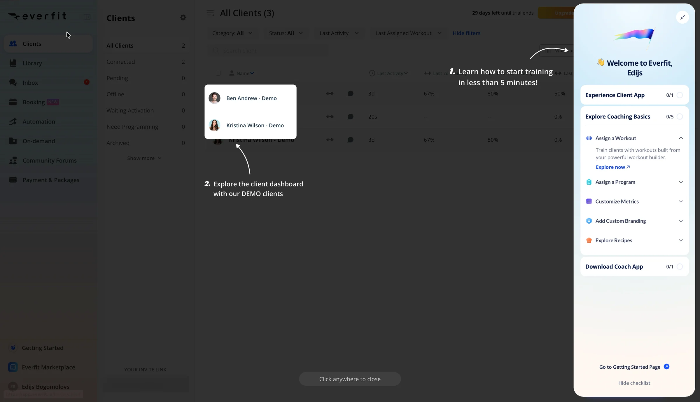
In roughly ten seconds, I've seen a note, a tooltip, an overlay, and a checklist drawer.
Each is trying to help.
Together, they're competing for my attention.

❌ One guide at a time.
Everfit already has a useful demo calendar.
It doesn't need four different instructions telling me what to do with it.
I'd rather see one clear action:
“Assign this workout to Kristina and see what she receives.”
That would teach me how the product works while moving me closer to the outcome I came for.
The lesson: Don't measure onboarding quality by how much guidance you provide. Measure whether users can complete the next meaningful action without getting lost.
Three minutes in, I still haven't experienced the value
I open the client list.
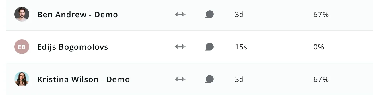
There are three clients:
- Ben Andrew — Demo
- Kristina Wilson — Demo
- Edijs Bogomolovs
Clicking “Invite myself” made me one of my own clients.
My recording ends at 2:59.
The checklist still says “0 of 7 completed.”
I haven't assigned a workout.
I haven't seen one appear on a client's phone.
And that's the problem.
Everfit got me into the product in 93 seconds.
But by the end of my recording, I still hadn't completed the action that would show me why I should pay for it.
❌ Don't confuse product exploration with activation.
A user can open screens, read tooltips, and click through features without getting any meaningful value.
For Everfit, I'd define a stronger activation milestone around two actions:
A coach assigns a workout, and a client opens it.
That's when the product has done the job it was hired to do.
It's a proposed activation metric, not a claim about how Everfit currently measures success.
The lesson: Track the action that proves users achieved something valuable, not just whether they completed onboarding tasks.
6. How I'd redesign Everfit's first experience
I wouldn't rebuild the entire product.
Everfit already has most of what it needs: a fast sign-up, useful demo clients, prepared workouts, and a way to preview the client experience.
The problem is how those pieces connect.
I'd redesign the first screen around one outcome:
Show the coach what their client will receive.
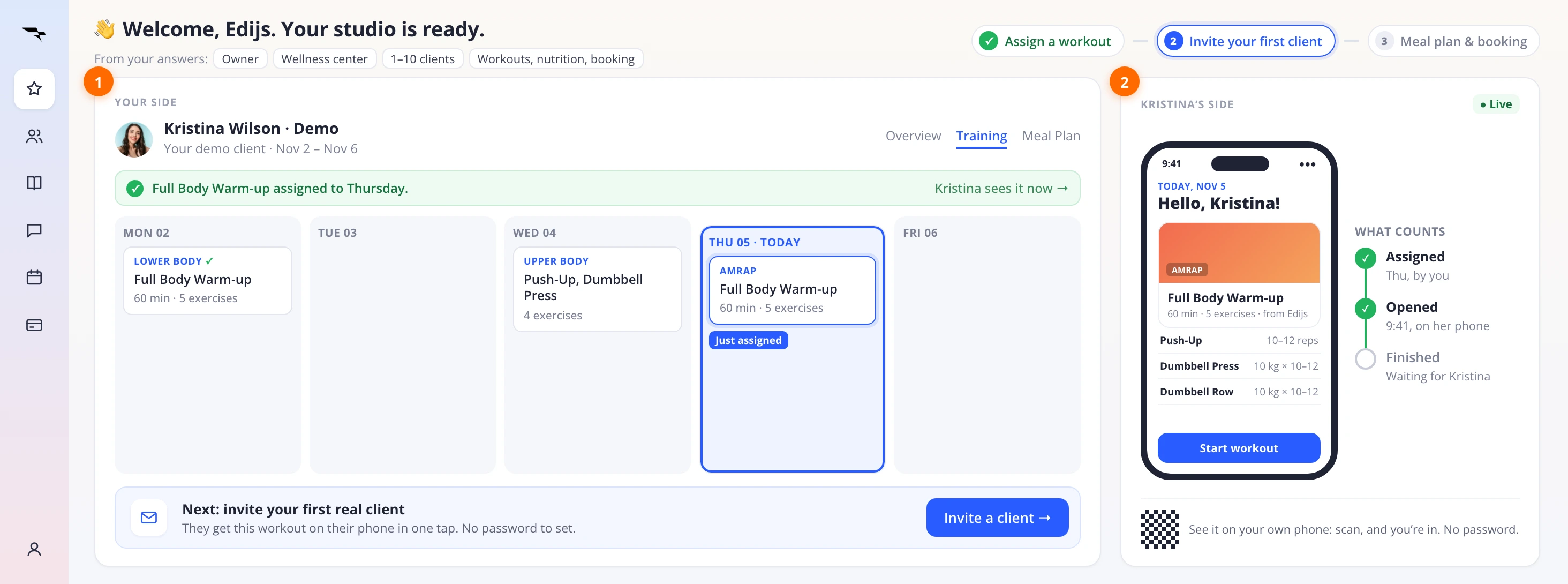
Instead of a generic checklist, I'd use two columns: the coach's workspace on the left and the client's phone on the right.
First, use what the coach told you
During sign-up, I said I run a wellness center with fewer than ten clients and want workouts, nutrition coaching, and booking.
The first screen should reflect that.

I'd show a simple plan:
- See your first workout on a client's phone.
- Invite your first real client.
- Set up nutrition coaching and booking.

No seven-item checklist.
No features unrelated to my immediate goal.
Why: Everfit already collected the information needed to make onboarding relevant. It should use it.
Second, start with a workout that's already assigned
On the left, I'd show Kristina's demo calendar.
A workout is already assigned for today.
I don't need to build anything yet.
I can see how the coach side works immediately.
Below the calendar, I'd show one next step: invite your first real client.
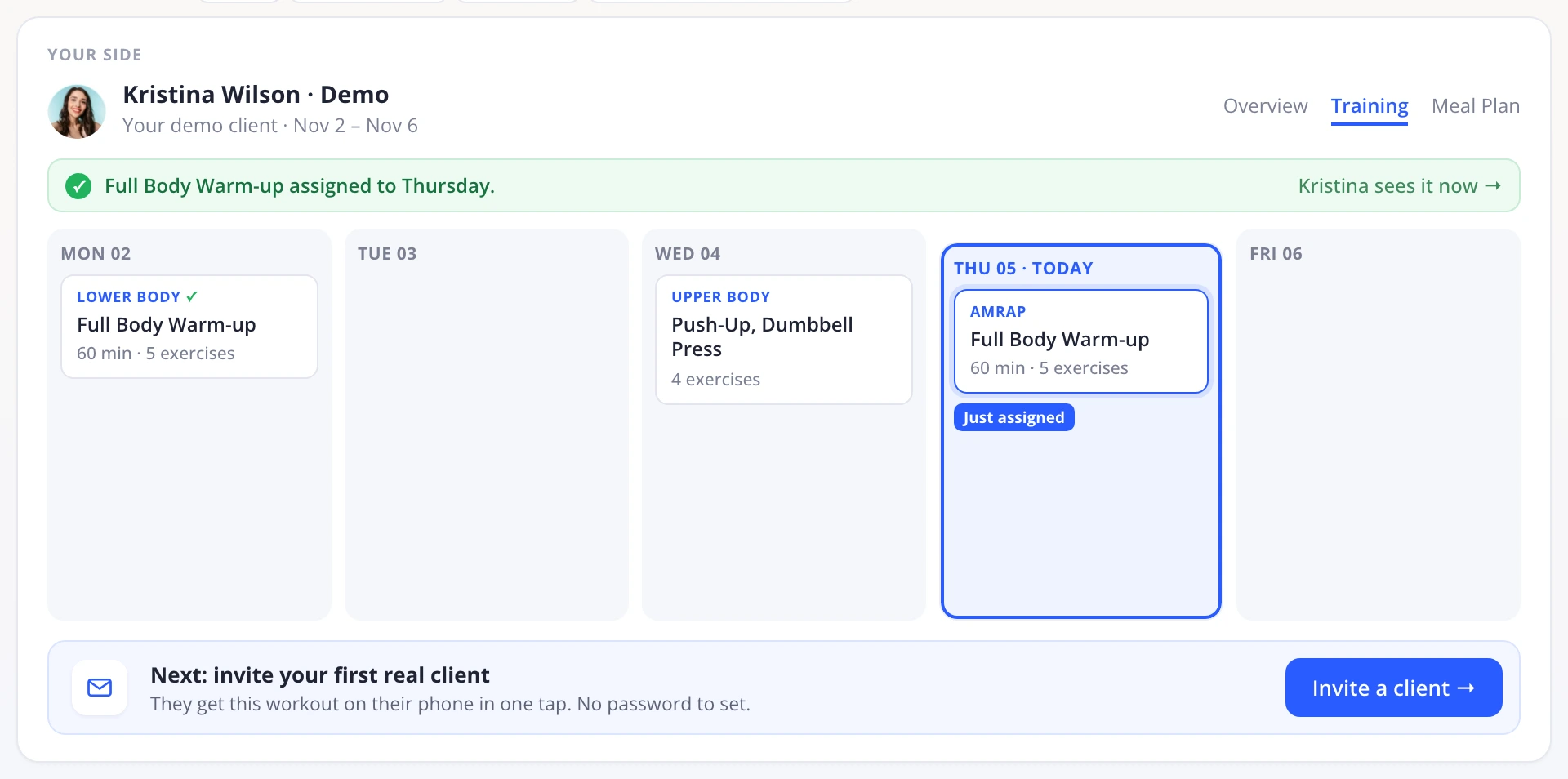
Why: Prepared demo data lets users understand the product before asking them to invest time setting it up.
Third, show the client's phone next to the calendar
On the right, I'd show a live preview of Kristina's phone.
The workout from the calendar appears on her screen.
I can see the exercises, instructions, and what she'll be able to follow.
I'd also show three simple states:
Assigned. Opened. Completed.
And if I want to try it on my own phone, I can scan a QR code.
No email invitation or password needed for the demo.
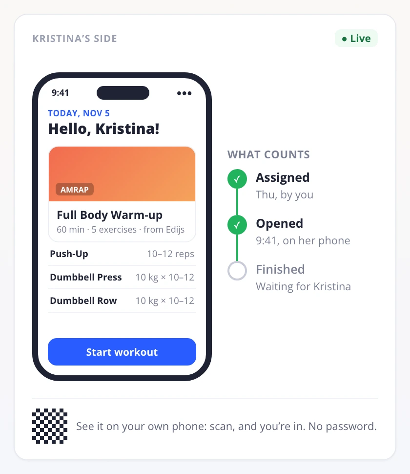
Why: The coach should be able to see the outcome they're paying for without leaving the product.
Finally, measure the right actions
Today, Everfit shows me “0 of 7 completed.”
I'd rather know whether I've done the two things that matter:
Assigned a workout.
Had a client open it.
That's a much stronger indication that I've experienced the product's value.
It also gives the growth team a more meaningful way to understand where users get stuck.

7. Three experiments I'd prioritize
If I were working on Everfit's activation and trial-to-paid conversion, I'd start with three experiments.
Experiment 1: Show the client app inside the browser
Problem: The most important product experience requires leaving the desktop, opening email, downloading an app, and logging in again.
Change: Add an interactive client-app preview next to the demo workout calendar.
Hypothesis: More coaches will understand the product's value without abandoning onboarding.
Measure: Percentage of new coaches who experience the client view, assign a workout, and invite a real client.
Experiment 2: Replace the generic checklist with a goal-based plan
Problem: Everfit asks what users want during sign-up but doesn't reflect those answers in the first checklist.
Change: Build the onboarding steps around each coach's selected goals.
Hypothesis: More coaches will complete a meaningful first action when onboarding matches what they came to do.
Measure: First-workout assignment rate and time to first workout assigned, segmented by selected goals.
Experiment 3: Remove competing onboarding instructions
Problem: A note, tooltip, overlay, and checklist appear within seconds of each other.
Change: Replace them with one contextual prompt that guides users toward assigning a workout and seeing it from the client's perspective.
Hypothesis: Fewer competing instructions will make the first action easier to complete.
Measure: Workout assignment completion rate, time to completion, and abandonment during the demo.
I'd prioritize the first experiment because it addresses the biggest gap I experienced: I couldn't easily see what my client would get.
These are hypotheses to validate, not guaranteed conversion improvements. I'd also track trial-to-paid conversion over time to check whether improvements in early activation lead to more paying customers.
8. The real problem isn't sign-up. It's what happens next.
Everfit gets a lot right.
The homepage gives me enough confidence to try it.
Google sign-in removes unnecessary typing.
The three-step registration is clear.
The 30-day trial doesn't require a credit card.
And the demo clients mean I don't start with an empty product.
But the experience breaks down at the moment that matters most.
I want to see how a workout reaches my client.
Everfit knows that's important. It puts “Experience Client App” first on the checklist.
Then it sends me to an email, a mobile app, and a password I never created.
The product has the right feature.
It just makes the value harder to experience than it needs to be.
What Everfit gets right
- Fast sign-up: 93 seconds from starting the trial to reaching the product.
- Clear trial terms: 30 days, all Pro features, no credit card.
- Smart use of Google sign-in: My name is filled in automatically.
- Useful demo data: Two demo clients with prepared workout calendars.
- Recognition of the client experience: Everfit puts it first on the onboarding checklist.
What I'd improve
- Homepage clarity: Explain what coaches can accomplish, not just who the product is for.
- Personalization: Use the goals collected during sign-up to guide onboarding.
- Time to value: Let coaches see the client experience without another login.
- Guidance: Replace competing instructions with one meaningful next action.
- Activation measurement: Focus on workouts assigned and opened, not checklist completion.
The bigger SaaS growth lesson
Most SaaS onboarding is designed around the person signing up.
But not every product delivers its value to that same person.
In a CRM, I might get value by organizing my own contacts.
In a form builder, I get value when someone submits a response.
In a coaching platform, I get value when my client receives and follows the workout I've created.
The buyer and the person receiving the value aren't always the same.
That's why onboarding needs to show the buyer what happens on the other side.
If your product depends on another person doing something, ask yourself:
Can the person signing up experience that outcome before they invite anyone?
For Everfit, the answer could be as simple as showing the client's phone next to the coach's calendar.
Same 93-second sign-up.
But this time, I'd see why the product is worth paying for before closing the tab.
Who gets the value in your SaaS: the person signing up, or someone they invite? I'd love to hear how your product handles that moment.
I break down real B2B SaaS trials to show where they lose potential paying customers and how to improve the experience.
Want me to review your trial? DM me “teardown” on LinkedIn.
Eddy
Pipedrive Showed Me a Pipeline Full of Deals (Mine Had Zero)
Pipedrive, Nov 6, 2026