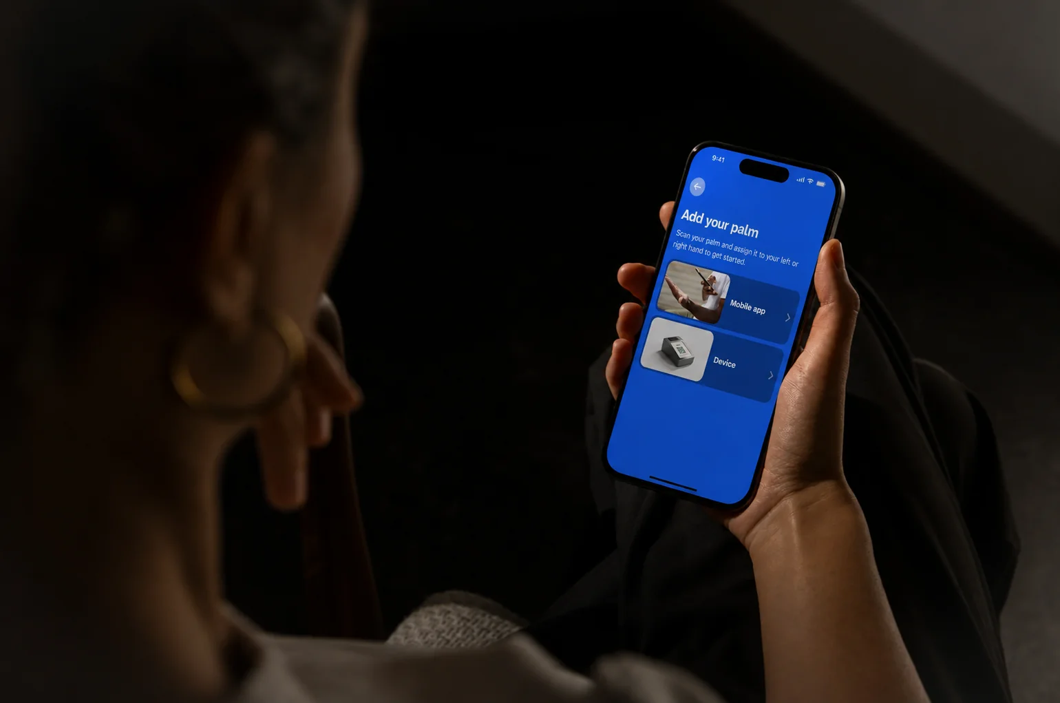
Handwave is a young company from Riga. It lets you pay by scanning your palm. First you have to add your hand and learn the scan. That first setup now takes 40% less time.
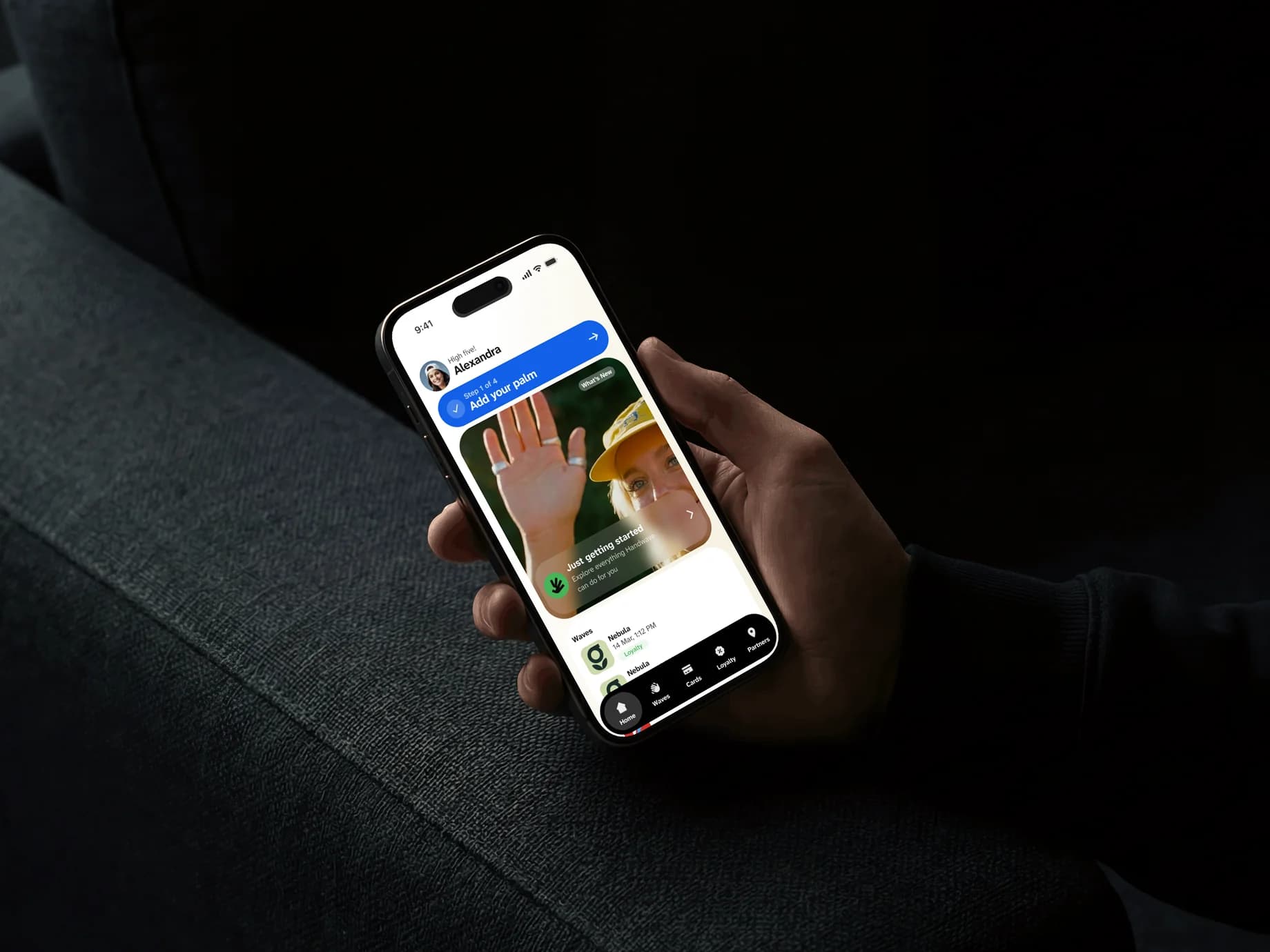
They hired me to fix how the phone app and the palm scanner work for people. I designed the two as one thing. The first steps start with the win, paying in a second. Only then do they ask for your hand. The app teaches the scan before the first real checkout. So a new shopper gets to the scanner knowing what to do.
Try the real experience- Product
- Handwave, pay by palm, from a young Riga company
- My role
- Product designer. I redesigned the phone app and the palm scanner.
- Focus
- First steps, first payment
Result
- 40%
- less time to set up a first payment
“Eddy really understood what we were trying to achieve with Handwave and helped us turn a complex idea into a simple and intuitive experience. He challenged our thinking, brought strong product and UX expertise, and was flexible and responsive throughout the process. His work covered both our mobile app and palm-payment device, and he added real value to the product. I would highly recommend working with him.”
The app and the scanner felt like two products
Both existed but felt apart. Scanning was confusing. The app's first steps and menus had problems, and screens did not match. A new shopper met all that before the first payment.
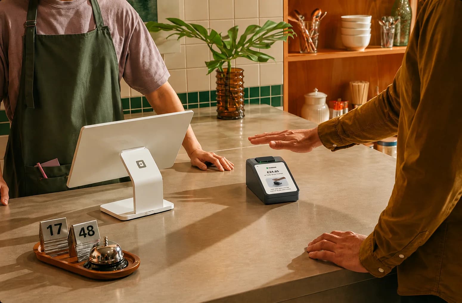
What made setup shorter
- 01
The win before the ask
Adding a palm is a strange ask. The first steps show paying in a second, then ask for the hand.
- 02
The app teaches the scan
A palm scan works or fails in one second at the scanner. The app teaches the scan before the first real checkout. So nobody learns it with a line behind them.
- 03
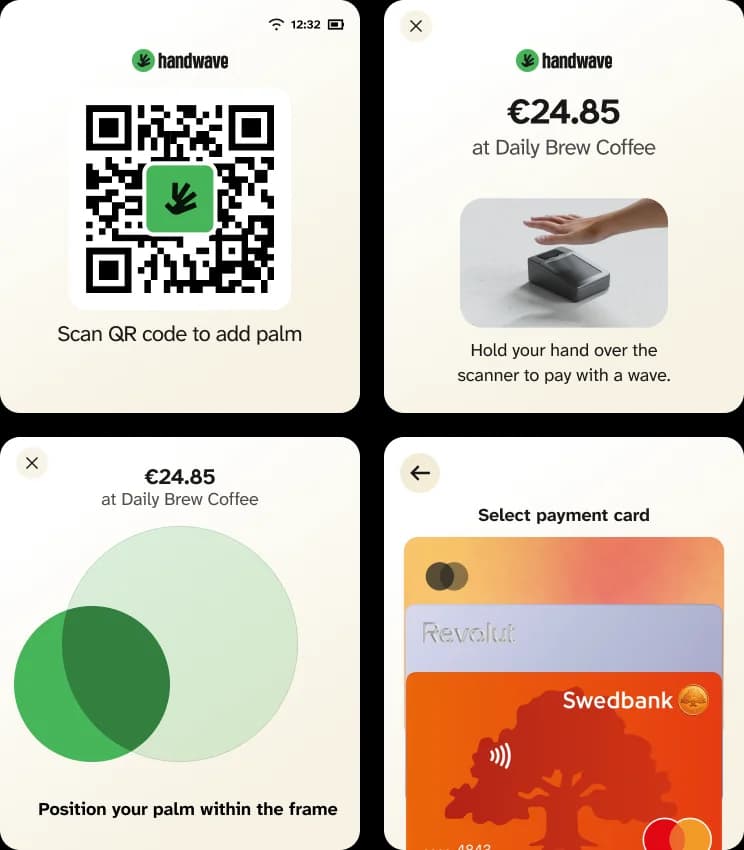
One set of parts for scanner and app
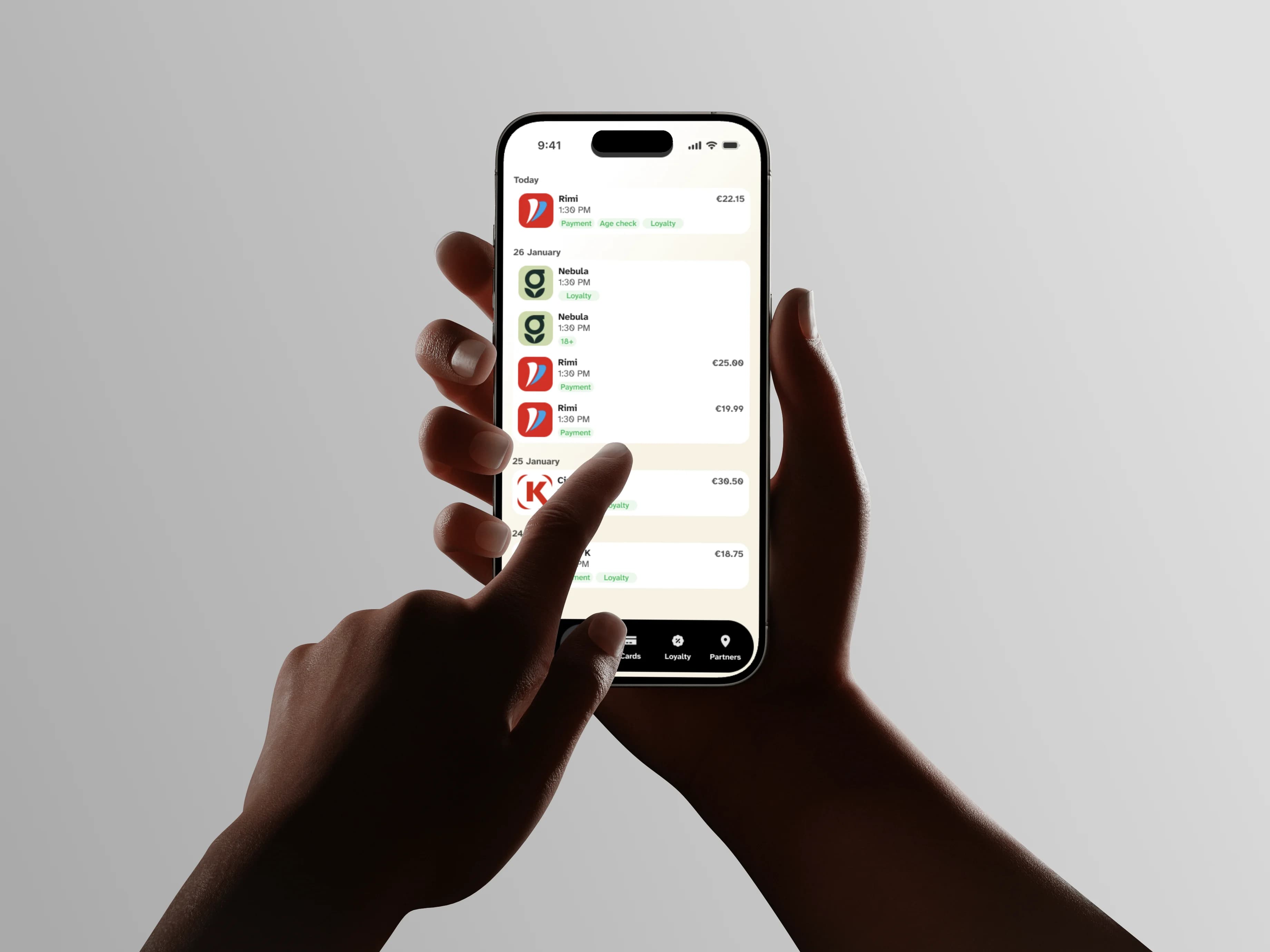
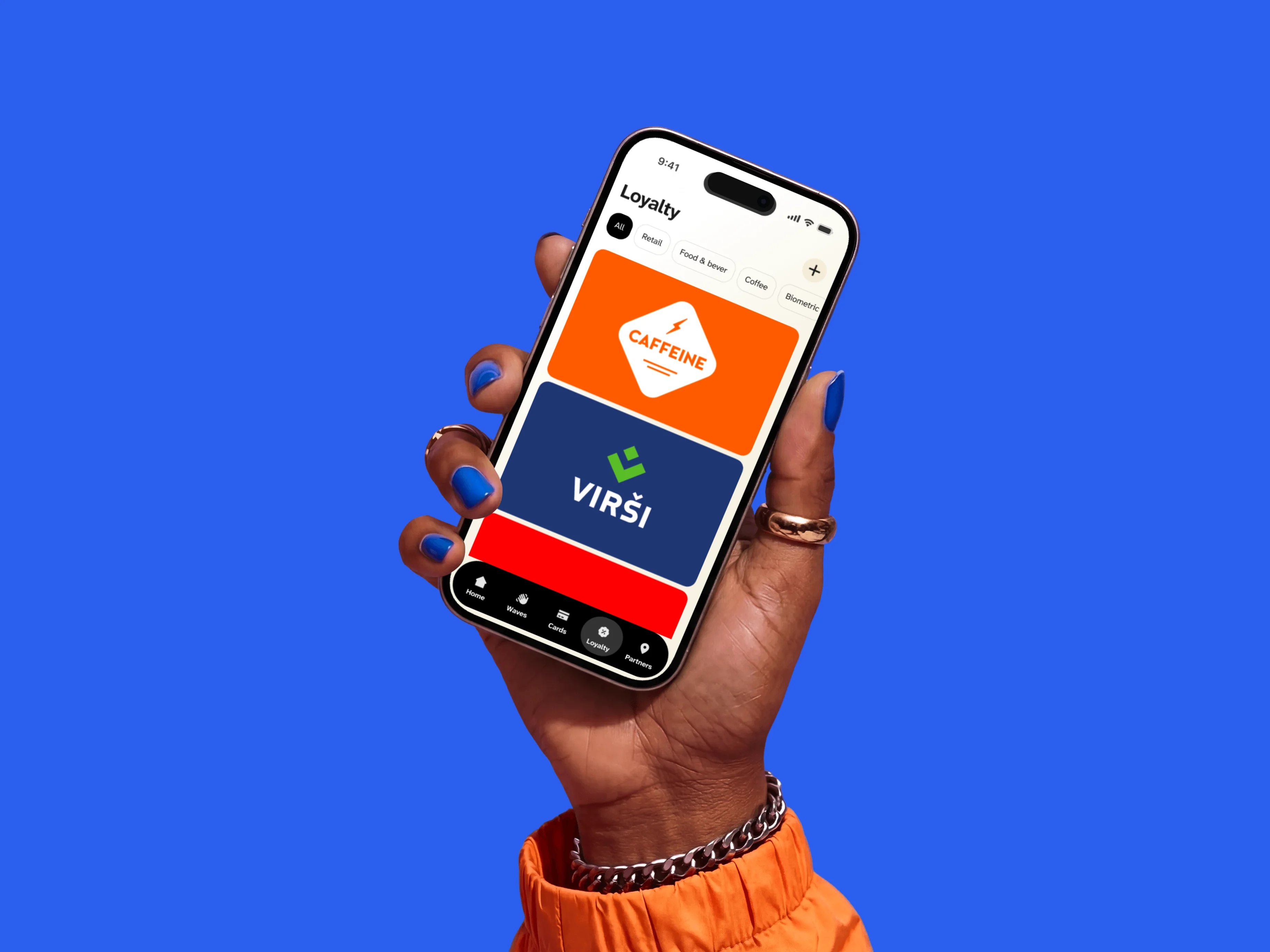
Both share the same words, parts, and status screens. A scan and a receipt in the app feel like one action.
- 04
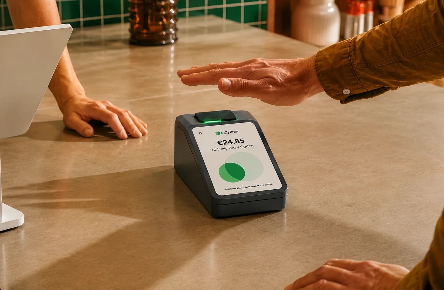
Animations for the palm and the payment
Animations show where to hold the palm and what the payment is doing.
What this project teaches
- 01
Watch the checkout, not the sketch
Bob Baxley says to stand at a self-checkout and watch what people really do. A palm scan works or fails in that one second at the scanner. So the scanner and the app were designed as one thing.
- 02
An extra step is fine if it shows the win
Kristen Berman's work shows this. A step that makes the win clear helps more people finish, not fewer. A shorter setup does not mean cutting the step that says why to finish.
- 03
Two devices, one product
Two devices built apart feel like two products. To a shopper, a palm scan and a receipt in the app are one action. So they must be designed together.