Instagram Nailed the Upgrade (But Forgot the Aha Moment)
5 min read · about Instagram Plus ·
Instagram Nailed the Upgrade (But Forgot the Aha Moment)
1 / 19

Written by
Eddy Bogomolov
Product designer for B2B free trials
Published
What you'll learn
- Why an offer on the screen where the feature lives beats any upgrade banner
- Why “You’re subscribed” isn’t enough: two minutes after paying, I couldn’t find the feature I’d paid for
- How three tips on the right buttons did what welcome screens never do
I wasn’t shopping. I opened the viewer list of my own story, and Instagram sold me a subscription before I could scroll.
Instagram Nailed the Upgrade (But Forgot the Aha Moment), chapter by chapter
I wasn't shopping. I opened the viewer list of my own story, and Instagram sold me a subscription before I could scroll.
In this story I'm a regular Instagram user with 145 people watching my story. No plan to pay for Instagram, ever. Snapchat+ passed 25 million subscribers and a billion-dollar run rate before Meta copied it, Evan Spiegel told Lenny Rachitsky this spring. This is what the copy feels like from the inside.
So I recorded my screen from the first tap to the first feature I used. Here is what Instagram times right, twice, the one screen in between where it goes quiet, and how I paid for one feature and ended up using another.
What I found:
- An offer on the screen where the feature lives, timed to the second, gets the tap.
- One plan, one price and an Apple checkout take the yes in 19 seconds.
- Back on the list, the feature I'd paid for sits there with nothing pointing at it. Three tips bring me back, and sell me something else.
Let's get into it.
1. The trigger: asked at the right second
Meet me. I just posted a story, and 145 people watched it. I open the viewer list to see who. I'm not shopping for anything.
Before I can scroll, a card slides up over the list:
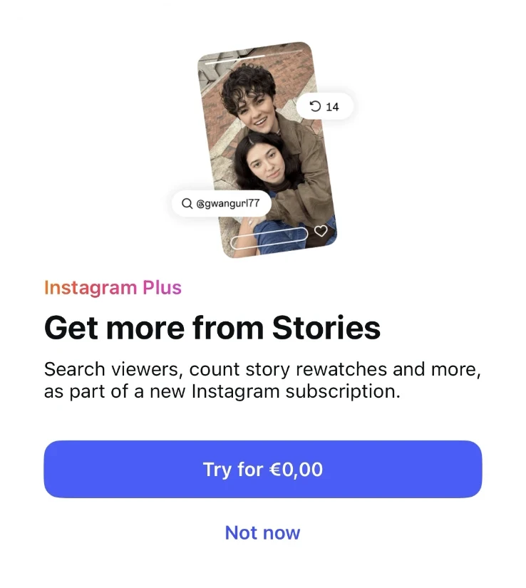
"Get more from Stories. Search viewers, count story rewatches and more." Try for €0,00.
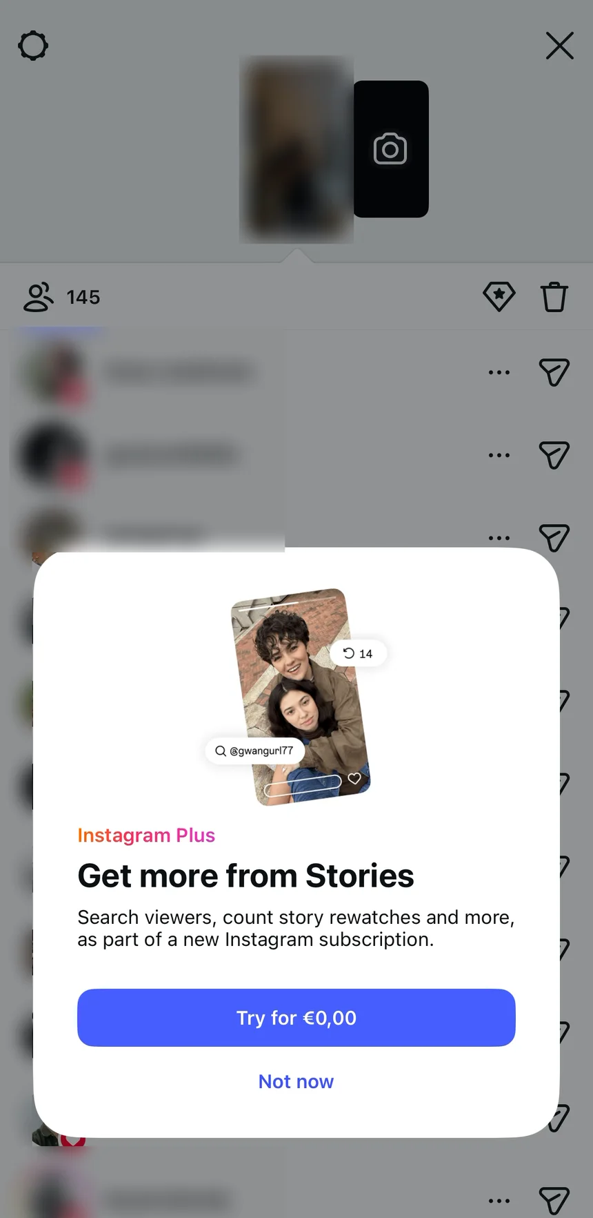
Search viewers, on the viewer list. That's the exact thing I was about to do by scrolling. Fine, let's try it.
I scroll past upgrade banners all day. Why did I tap this one? Because it showed up on the list I was reading, and named the thing I was about to do on it. Instagram picked the second, not just the screen.
If you read my LinkedIn teardown, you've seen this pattern already. BJ Fogg's Behavior Model: I wanted it, it was easy, and it asked at that second. All three lined up, and I tapped.
2. The paywall: one plan, pictures first
"Eddy, try Instagram Plus free for one week." My name, one plan, one price: €2.99 a month. And search, the thing I came for, is the first line under "Explore all benefits".
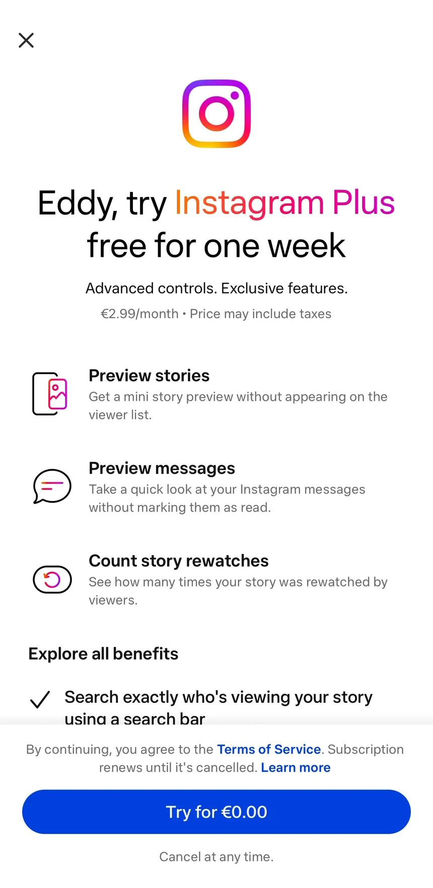
The same button, twice. "Try for €0,00" on the card, "Try for €0.00" on the paywall. Same promise, even if the comma turned into a dot.
Then the list. Twenty benefits, in one scroll.
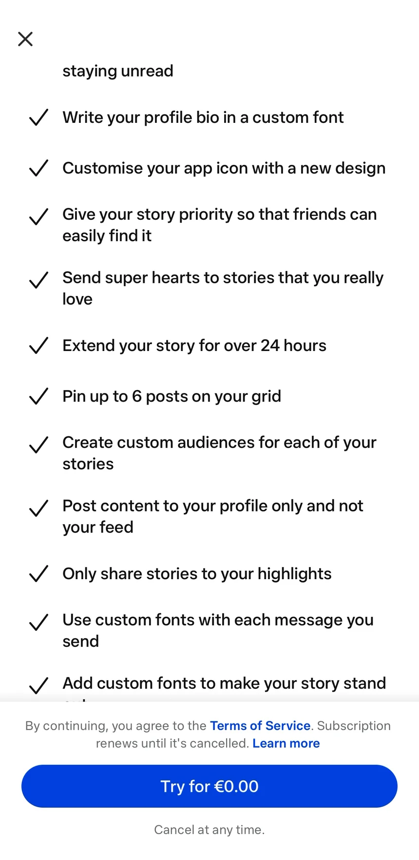
Would I ever read a list that long? No way. Somewhere in the middle sits "Extend your story for over 24 hours." I scroll straight past it. Remember that line.
3. Checkout: let Apple take the money
Okay, let's subscribe. I tap "Try for €0.00". A spinner, and Apple's sheet slides up: one week free from 19 Oct, then 2,99 € a month from 26 Oct. No card form, no address, no new password.
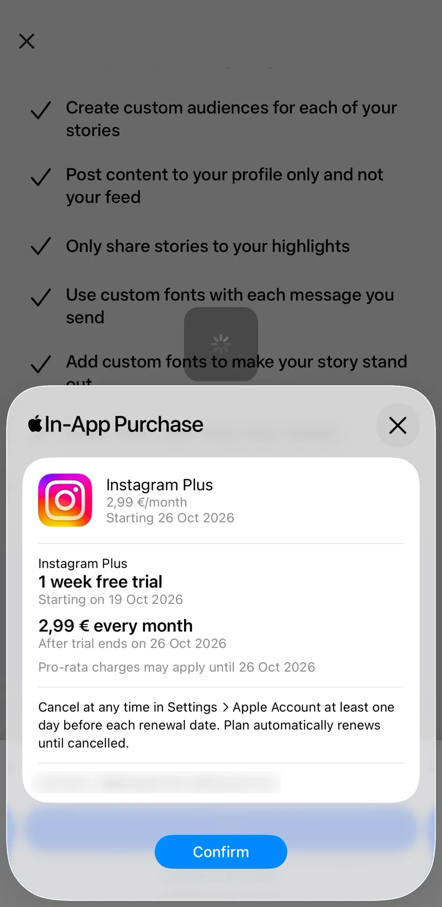
Confirm. Apple checks it's me, then a blue tick: "Done". Back in Instagram, "You're all set. Your purchase was successful." OK.
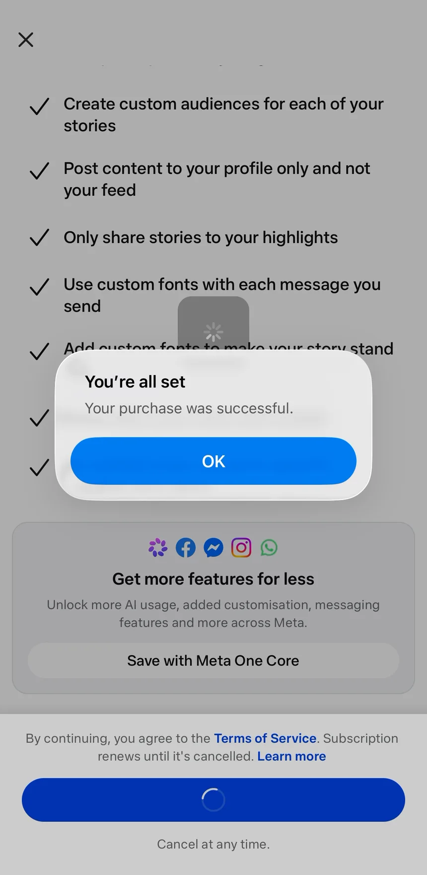
This is why I love paying inside an app. My card, my address, my receipt already exist. I never saw a form.
From the offer to my yes: 19 seconds. Then Apple and my bank take 84 seconds of checks, which aren't Instagram's to fix. Then the part that is.
4. After the yes: the quiet screen
Funny. Two minutes ago I paid to search this list. Now I'm back on it, a toast says "You're subscribed!", and I can't see what changed.
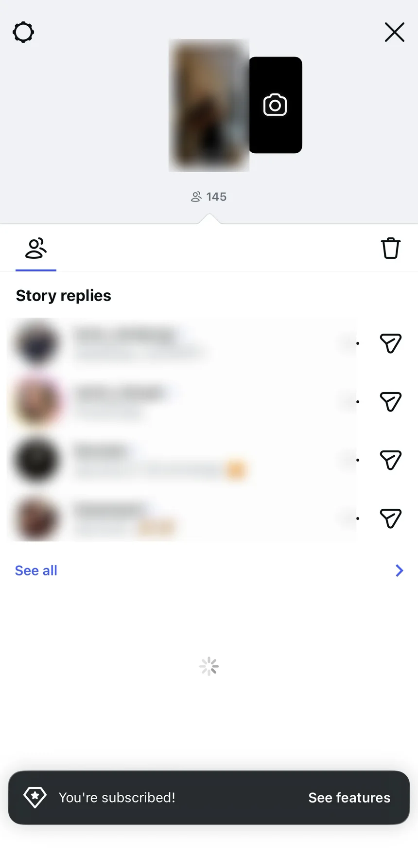
Hold on. Is that... a search bar? Is this the new feature I paid for?
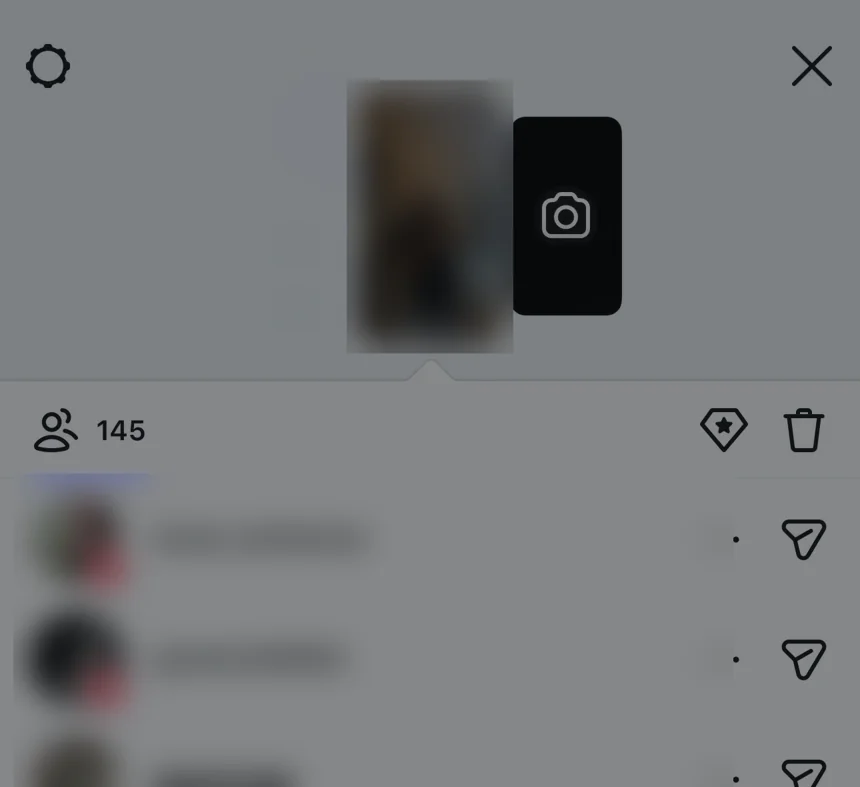
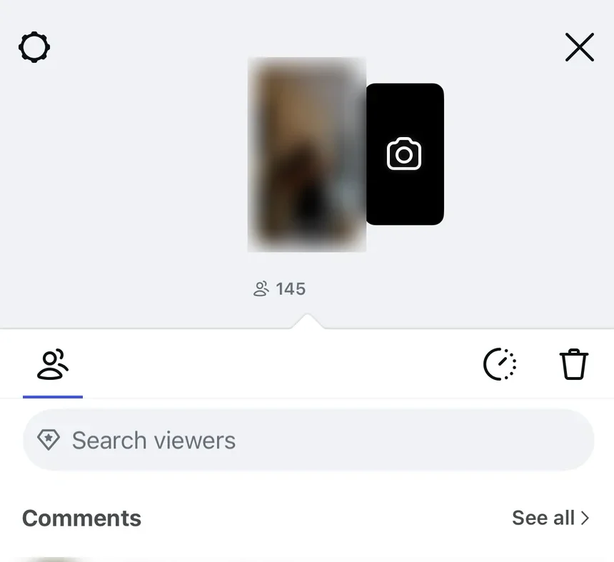
Same screen, before and after. The search bar is right there, and it's really hard to see: grey on grey, nothing pointing at it. On a phone, on the go, I scrolled straight past it.
5. Three tips, right on time
Then, right on time again. Three tips land on this screen, one per button. The first explains the search bar I missed. The second: "Extend your story. Keep your story visible for 48 hours."
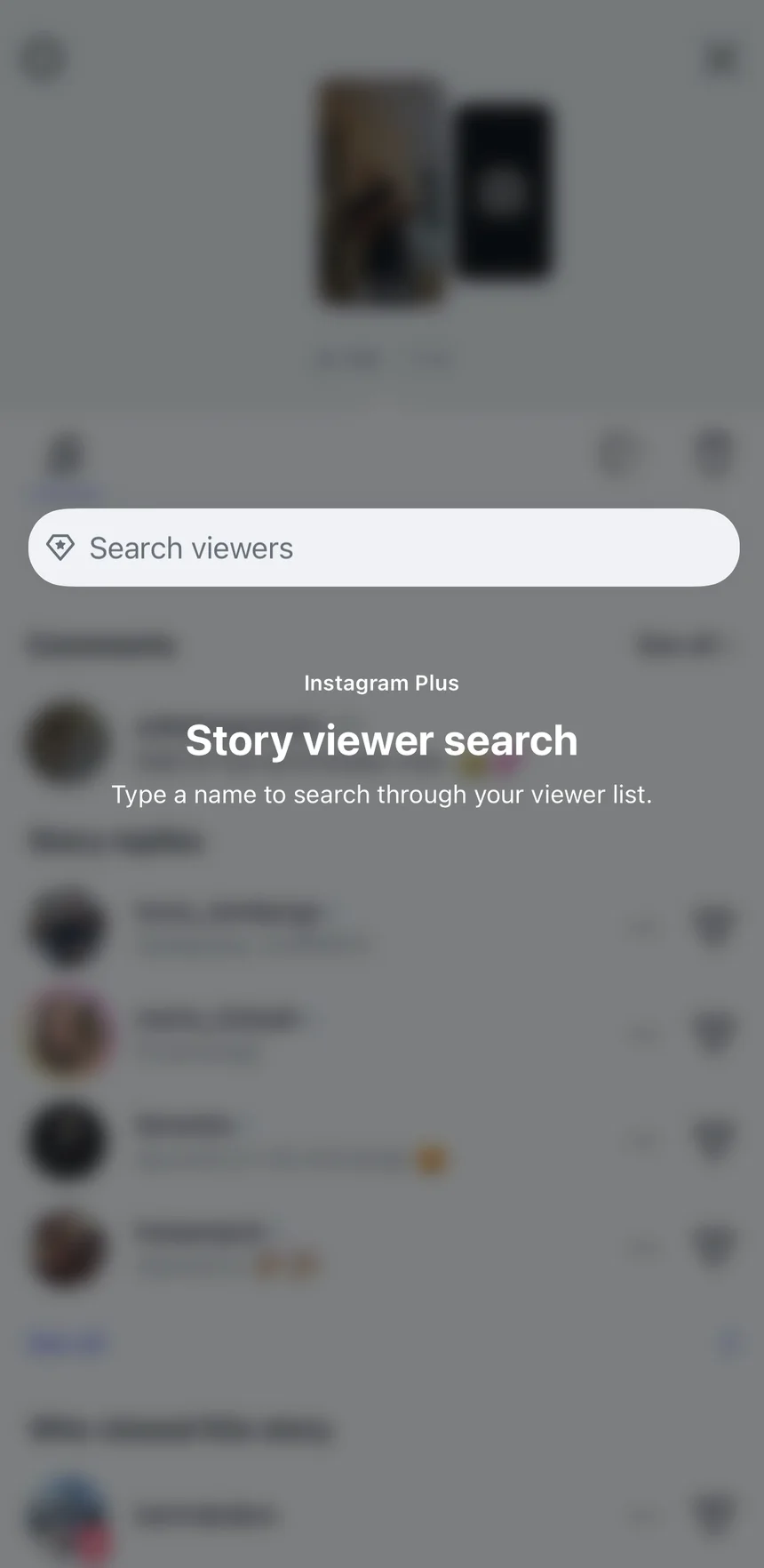
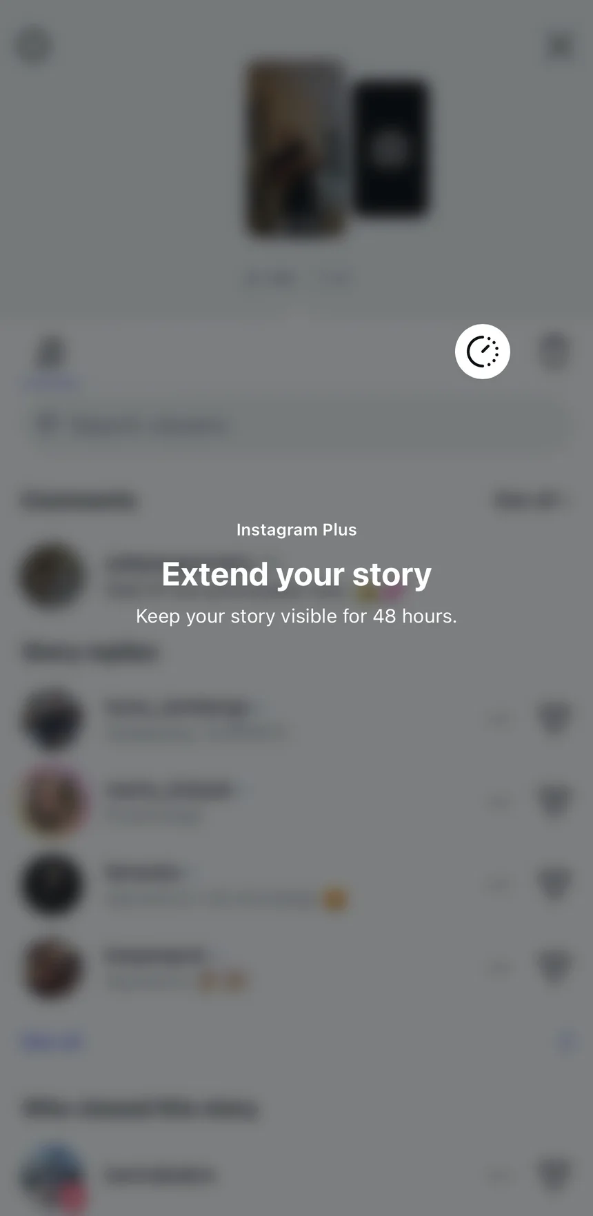
No tour, no welcome page. Each tip sits on the button it explains and says three things in three lines: whose feature, what it does, what I get.
"Story extended." I came for search. I leave having extended my story, a feature I skimmed past on the paywall. 2 minutes 15 seconds from the first tap.
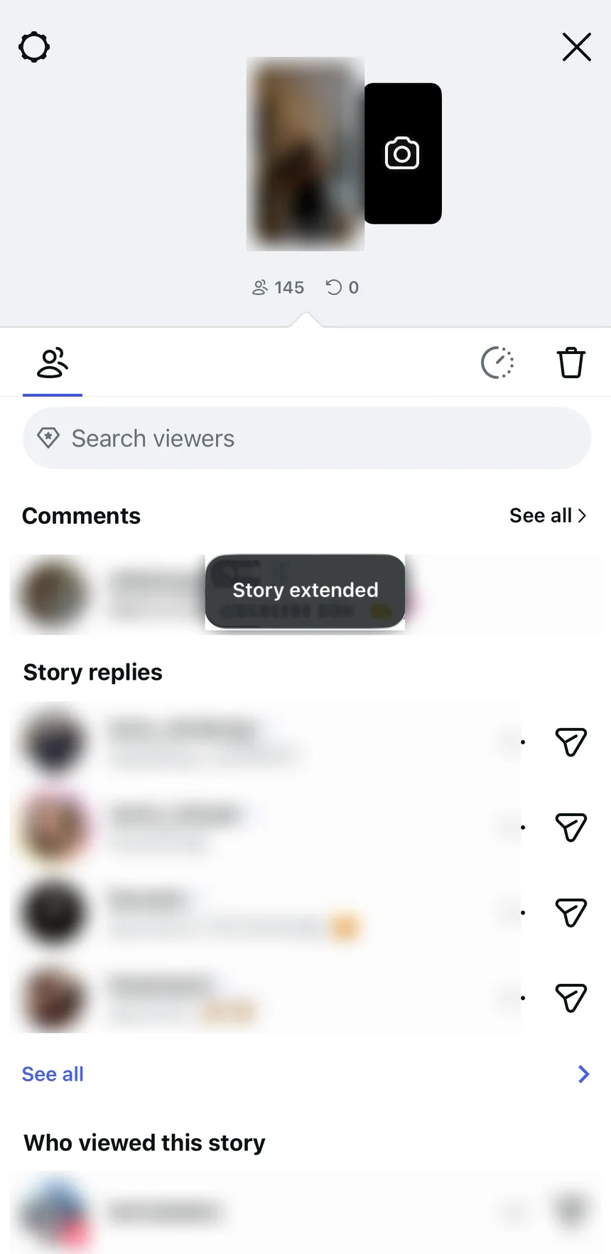
Right on time, twice
Near-perfect. Instagram timed the ask right. When I lost the thread, the tips brought me back, and sold me a second feature on the way. LinkedIn took ten screens and never brought me back.
The whole journey, from my recording:
- 0:00 · Plus card on my viewer list · ✅ Asked right on time
- 0:19 · "Try for €0.00"
- 1:43 · "You're all set"
- 1:48 · Same list, a toast · ❌ Went quiet
- 1:54 · Three tips on the buttons · ✅ Reminded right on time
- 2:15 · Story extended
The fix: Say what I just paid for on the landing screen itself. The timing is already right.
The six lessons
- Show the offer at the right moment · ✅
- Pictures first, words second · ✅
- Let Apple take the money · ✅
- Tell people what they just paid for · ❌
- Explain a feature when I need it · ✅
- What sells isn't always what sticks · ✅
Zoom out
Instagram Plus is a copy. Snapchat+ got there first, and Snap's product chief Peter Sellis told Lenny this autumn that with a messaging app "you first become acclimated to using the product daily and getting a lot of value out of it, and that's when you see the value of the subscription product, not right when you start" (Lenny's Podcast).
That's the whole trick here. Instagram didn't ask a new user. It asked a daily one, on the list of their own story, at the second they wanted the thing. Then it nearly lost the sale on the next screen, and got it back with three tips.
If you run a trial: the ask is the easy part to get right. The screen after the yes is where I'd look first.
What does your product show on the first screen after someone pays? Leave a comment. I read every one.
Further reading:
- LinkedIn's Premium upgrade nails the paywall, then fumbles the trial, the previous teardown
- The subscription value loop, Phil Carter in Lenny's Newsletter
- How to accelerate growth by focusing on the features you already have, Ken Rudin in Lenny's Newsletter
I break down real free trials and show where they lose paying users. If this helped, send it to someone who owns a trial.
Want a teardown of your trial? DM me "teardown" on LinkedIn.
Eddy
 LinkedIn
How LinkedIn turned a perfectly timed trial offer into 10 screens of friction
·6 min